There’s a particular kind of fatigue that sets in after a decade of the same paint chip. Greige walls. White trim. A gray sectional. A house that looks, more or less, like every other house on the street that got renovated in the last ten years, calm, inoffensive, and a little bit forgettable. If you’ve felt that fatigue lately, you’re not imagining it, and you’re definitely not alone. Walk into any paint store this year and you’ll notice the shift immediately: the beiges have gone warmer, the grays have all but disappeared from the “color of the year” conversation, and there’s a whole wall of deep, saturated, nature-pulled tones that didn’t exist on those same shelves five years ago.
2026 is shaping up to be the year homes stop apologizing for having a personality.
The decade of flat neutrals is finally ending
To understand why this year’s palette feels like such a relief, it helps to remember what came before it. The 2010s gave us gray cool, clinical, “agreeable” gray, on every wall from coast to coast. The early 2020s softened that into greige and warm white, a kind of safe middle ground that photographed well but rarely felt like anyone actually lived there. Both eras shared the same underlying instinct: neutralize everything, so the room never risks feeling dated or, worse, too personal.
What’s happening now is the opposite instinct. Paint companies, colorists, and interior designers are independently converging on richer, earthier, more deliberately characterful palettes — and they’re doing it for reasons that go beyond fashion. Several of the major forecasts for the year explicitly connect the shift to a renewed respect for nature and traditional craft, treating color less like a styling choice and more like a value statement about how people want to live. That’s a meaningfully different conversation than “gray is timeless.” It’s closer to “I want my house to feel like it came from somewhere.”
So what are the actual colors carrying that conversation in 2026? A few families keep showing up, and each one is doing slightly different emotional work.
Ochre and golden yellow: the new neutral
If there’s one color having a real moment this year, it’s ochre and not the timid, butter-yellow version that’s flirted with trend status before. This is a deeper, earthier, more confident yellow, closer to a spice rack than a nursery. Several major paint brands picked some version of it as a flagship shade for 2026, and more than one designer has started describing warm yellow as the new neutral, a color you can build an entire room around rather than use as a single accent.
What makes ochre work where past yellows have failed is the company it’s keeping. It’s not being paired with crisp white trim and a pop of teal, the way a “fun” yellow accent wall might have been styled a decade ago. It’s showing up next to raw wood, aged brass hardware, and other warm, textural materials which softens it considerably and makes it read as grounded rather than loud. A kitchen with ochre cabinetry and a butcher-block counter doesn’t look like a design risk. It looks intentional, almost like it’s always been there.
There’s also a genuinely interesting emotional argument for yellow’s return, separate from the design logic. More than one colorist has pointed to bold yellow as a kind of antidote to a stressful few years, a color choice that’s unapologetically cheerful at a moment when a lot of people are craving exactly that. Whether or not you buy the psychology, it’s hard to deny that a confident yellow front door does something a beige one simply doesn’t..
Deep, grounded greens: bringing the outside in, but moodier
Green has been trending for a while now, but the version dominating 2026 isn’t the soft sage or eucalyptus that’s been popular in nurseries and bathrooms for the last several years. This year’s green skews deeper inky, almost black-green in some applications, or a smoky jade that one major paint brand is marketing as a “new neutral” in its own right.
The appeal here is fairly intuitive: deep green does what beige always promised to do sit quietly in the background except it actually has depth and warmth instead of just absence of color. It pairs beautifully with the same raw materials driving the rest of this year’s palette: walnut and oak furniture, woven textiles, unlacquered brass. And because it’s dark rather than pastel, it works in spaces that pale sage never quite could a moody home office, a cozy den, even a powder room where you want drama rather than freshness.
If ochre is this year’s argument for confidence, deep green is the argument for groundedness. It’s the color equivalent of a heavy wool sweater: substantial, a little serious, completely unbothered by trend cycles.
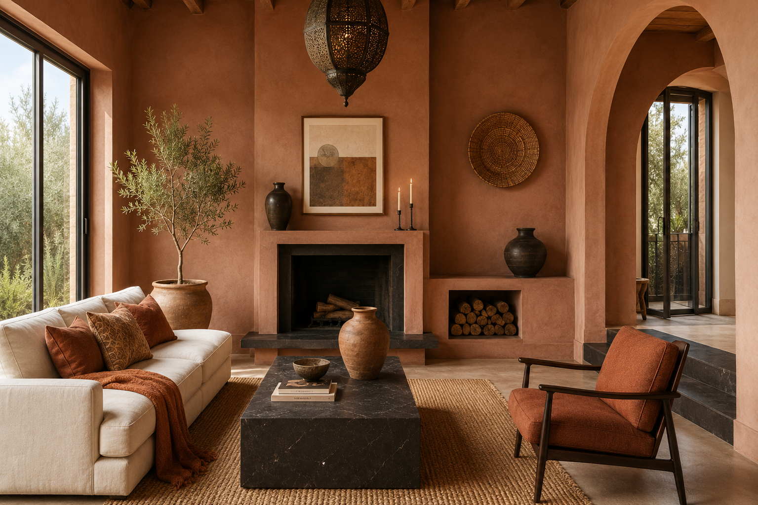
Rich umber and chocolate brown: the quiet luxury evolution
For the last couple of years, “quiet luxury” has been one of the most overused phrases in interior design usually shorthand for expensive-looking neutrals that don’t try too hard. In 2026, that aesthetic is finally getting some warmth injected into it. One of the year’s most talked-about paint picks is a deep, layered neutral that blends burnt umber with notes of charcoal, not flat brown, but something with real tonal complexity that shifts depending on the light hitting it.
This is the color family for people who want their home to feel expensive and grown-up without it reading as cold. Designers have been reaching for rich chocolate brown specifically in bedrooms and dens, the kind of rooms where you want enclosure rather than openness and a deep brown wall, paired with warm lighting and a few brass fixtures, does that in a way that feels cocoon-like rather than dark for the sake of it.
The thing that separates this trend from past “brown is back” moments is restraint paired with confidence. It’s not a wood-paneled 1970s den. It’s a single, deliberately chosen wall or a fully painted trim-and-ceiling moment in a small room, executed with enough precision that it reads as a choice rather than a default.
Transformative teal: the jewel tone everyone’s circling back to
Of all this year’s picks, teal might be the most surprising to anyone who associates it with early-2010s accent walls. One major international trend forecaster named a complex, moody version of teal its color of the year, and it’s easy to see why once you look at how it’s actually being used. This isn’t the bright, slightly cartoonish teal of a decade ago. It’s a deeper, more complicated shade that sits somewhere between blue and green without fully committing to either.
What makes it feel fresh again is the same logic running through the rest of 2026’s palette: after years of milky, muted versions of blue and green, there’s an appetite for something with more saturation and confidence. Teal also does something genuinely useful that beige never could-it looks dramatically different depending on the light. In full sun, it reads bright and almost tropical. In a dim, moody room, it goes nearly black-green. That range is part of why designers keep reaching for it in bathrooms and kitchens, where tile and cabinetry have to hold up under very different lighting conditions throughout the day.
Icy blue: the palette cleanser
With so much of this year’s conversation centered on deep, warm, saturated colors, it’s worth flagging the one cool tone that’s managing to hang on: a crisp, pale icy blue. It’s not the soft, slightly grayed-out “Swedish blue” that’s been popular for the last decade, and it’s not a true pastel either. It’s clear and a little frosty, which is exactly why it works as a counterpoint to everything else on this list.
Designers have been using it almost like a punctuation mark-a single icy blue sofa or chair dropped into an otherwise warm, earthy room, where it acts as relief rather than the main event. If your home is leaning hard into ochre walls and chocolate brown upholstery, a small dose of icy blue keeps the whole thing from feeling like a single, unbroken wash of warmth. It’s the design equivalent of a squeeze of lemon on something rich-not the dish itself, but the thing that keeps it from feeling heavy.
The quietly important shift: even the “neutrals” got warmer
It’s tempting to focus entirely on the bold, named colors of the year, but the more telling shift might be happening underneath all of them. The actual neutral base colors-the ones used for walls, ceilings, and trim throughout a whole house-have warmed up considerably. Soft, creamy off-whites have replaced the cool, slightly blue-toned whites that dominated for years. Warm khakis and creamy beiges are doing the work that gray used to do, but with noticeably more warmth in their undertone.
This matters more than it sounds like it should, because it changes how every other color in a room reads. A deep teal accent wall looks completely different against a warm cream trim than it does against a cool white one-softer, more integrated, less like a statement that’s fighting with its surroundings. The headline colors get the attention, but it’s this quieter shift in the supporting cast that’s actually making 2026’s palettes feel cohesive rather than like a collection of trend picks thrown into the same room.
Where the rules get broken entirely
Not everything happening in home decor this year is about sophisticated, nature-inspired restraint. There’s a parallel, louder trend running alongside all of this: a willingness to use genuinely bold, saturated color in ways that would have felt risky just a couple of years ago. Electric blue kitchen cabinets. Bright lime green paired against dark wood. Entire dining rooms painted a confident, unapologetic hot pink.
This isn’t really a contradiction of the warm, earthy movement-it’s the same underlying instinct taken to its logical extreme. Both trends are reactions against the same thing: a decade of rooms designed to be inoffensive rather than interesting. Whether someone expresses that with a deep ochre living room or a hot pink dining room, the motivation is identical. People are done decorating for an imaginary future buyer and they’re starting to decorate for the way they actually want to feel at home.
Room by room: where each color actually earns its place
Trend reports tend to show every color in the same kind of sun-drenched, magazine-ready living room, which makes it hard to picture where any of this actually belongs in a real house with real constraints. A rough guide, based on how designers have actually been deploying these tones this year:
**Kitchens** are where ochre and ochre-adjacent yellows are doing the most work right now, especially on cabinetry rather than walls. It pairs naturally with butcher block, brass pulls, and open shelving, and it photographs warm under both daylight and the kind of yellow-toned task lighting most kitchens already have. Deep teal is the other strong kitchen contender, particularly on an island or a tile backsplash, where its color shift under different lighting actually becomes an asset rather than a liability.
**Bedrooms** are where the deep, grounded colors-chocolate brown, inky green-tend to land best. Both work well as an all-over treatment (walls, trim, even ceiling) precisely because a bedroom benefits from that cocoon-like enclosure rather than needing to feel bright and open. Pair either with warm, low lighting and you get a room that feels deliberately calming rather than simply dark.
**Living rooms** are the most flexible, and probably the riskiest to overcommit in. A single deep-colored accent wall, a piece of furniture, or a layered mix-warm cream walls with a chocolate sofa, say-tends to age better than painting the entire room one saturated shade. This is also where the icy blue palette-cleanser earns its keep, as a single chair or throw that keeps an otherwise warm room from feeling like one continuous block of color.
**Powder rooms and entryways** are the lowest-risk place to go genuinely bold. Both are small, used briefly, and easy to repaint if a color stops working-which makes them the ideal testing ground for hot pink, electric blue, or any of the louder, rule-breaking choices showing up alongside this year’s earthier palette.
How to actually use any of this without it feeling like a trend chase
The fastest way to make a trendy color feel dated fast is to use it exactly the way it showed up in the marketing photos full saturation, every surface, zero restraint. A few ways to bring this year’s palette into an actual home without it reading as a 2026 time capsule:
**Start with trim, not walls.** Painting the trim and walls the same warm tone rather than the usual wall-color-plus-white-trim combination creates an enveloping, cocoon-like effect without committing an entire room to a single bold statement on every surface.
**Anchor bold colors with raw materials.** Ochre, deep green, and chocolate brown all read as sophisticated rather than gimmicky when they’re paired with unlacquered brass, raw wood, woven textiles, and matte (not glossy) finishes. The materials do as much work as the color itself.
**Use small, high-impact zones before committing to a whole room.** A front door, a kitchen island, a powder room, or a single accent wall lets you test a deep, saturated color at low risk. If you’re still loving it in six months, that’s your signal to go bigger.
**Contrast, don’t match.** Pairing a deep, moody color with something lighter, a creamy ceiling against chocolate walls, or a single icy blue chair in an otherwise warm room keeps a space feeling layered instead of like a single block of color.
**Let the room’s light guide the shade.** Teal and deep green in particular shift dramatically depending on natural light. Test a sample in the actual room, at the actual time of day you’ll use it most, before committing to a full gallon.
The bigger story behind the color chart
It’s easy to treat a “color trends” roundup as pure surface-level styling advice, but there’s a more interesting story sitting underneath this particular shift. After roughly a decade of homes designed to be universally inoffensive-easy to sell, easy to photograph, easy to forget, there’s a collective pivot happening toward homes that are designed to be lived in and felt, not just looked at. Ochre, deep green, chocolate brown, and moody teal aren’t really competing trends. They’re four different answers to the same question: what does a home look like when it stops performing neutrality and starts reflecting an actual person?
If beige was the color of a decade spent playing it safe, 2026’s palette is the sound of people deciding that’s no longer the point. You don’t have to repaint your entire house to participate in that shift. Pick the one color from this list that you keep coming back to, find the smallest wall in your home, and just try it. That’s really how every one of these “trends” started in someone’s actual living room before it ever showed up on a forecast.